When Great Data Does a Belly Flop,
Use the Hero’s Journey for Effective Data Storytelling
Have you experienced this: You’ve spent weeks, maybe months, on a project that has the potential to drive positive, systemic change in your organization. Your results are interesting and clearly presented. However, when you present to key stakeholders, your work fails to convince management that they should act.
If you’ve had great findings that failed to lead to action, chances are you had a communication problem. Most researchers are great at analyzing and presenting data. However, many of us struggle to tell our data’s story. For change to occur, our findings must not only be useful; they must be compelling. How we tell our data’s story is perhaps the most important factor in determining whether our work will live up to its full potential.
In this post, we will share a simple framework for effective data storytelling. This framework will allow you to communicate your findings in a way that inspires your audiences and leads them to action.
Some Guiding Principles
Before diving into the framework, it is worth laying out two guiding principles for effective communication.
- Keep reporting solution-focused: In business, research is undertaken to inform decisions. While it may be tempting to dig into and report on interesting findings, they are of little use if they are not aligned to the problem. Therefore, one key to effective data storytelling is to keep the business problem at the center of the analysis. In other words, reporting should always lead our audiences to a solution.
- Reporting should be highly visual and easily comprehensible: If our goal is for our results to have an impact, then our target audience should be stakeholders in positions that drive change. People in these roles are often busy and need to balance the time it takes to digest information with the urgency to act on it. Because of this, detailed tables and graphs, while important during analysis, are often not very effective for communicating at this level. Instead, make every effort to report your findings visually and in a way that makes comprehension not only easy, but fast.
Though not central to our storytelling framework, these principles are the foundation on which good data storytelling is built. Without these, we risk having our work put on a shelf never to see the light of day.
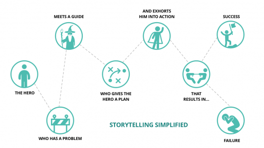
The framework: The Hero’s Journey
If you have an interest in literature (or movies for that matter), chances are you have come across the Hero’s Journey. The Hero’s Journey is a centuries-old framework for storytelling. While there are variations, the journey unfolds like this:
There is a hero who is faced with a problem.
The problem, if left unresolved, will result in negative consequences for either the hero or those the hero cares about.
In the hero’s search for a solution, he or she is introduced to a guide.
The guide, often older and wiser, gives the hero a plan for how to overcome the problem.
Faced with the knowledge of what he or she must do, the hero is challenged to act via an exhortation.
What follows is a struggle between the hero and the problem that ultimately leads to success or failure.
From: Building a Story Brand, by Donald Miller
While this may seem simple on the surface, the Hero’s Journey has been used over and over again to tell some of history’s most compelling stories (for contemporary examples, think Star Wars, Lord of the Rings, or Harry Potter). The good news is that this framework can be applied to just about any story – including the stories you tell from your data. To apply the hero’s journey to your data, use the following as a guide:
The hero: Your client
The problem: Your client’s business problem that motivated the analysis
The guide: You
The plan: Your methodology and analysis
The exhortation: Your recommendations
Also, it is wise to avoid these common mistakes:
- Making yourself the hero
- Making the data the hero
- Making the analysis the hero
In the next section, we will dive deeper into a case study for how this can be done.
The Hero’s Journey: A Case Study
In this fictitious example, we’ll show you how to apply the Hero’s Journey to a data analytics project. As a bit of background, this example draws from a problem faced by many organizations: the inability to segment prospects due to insufficient data. In this example, the deliverable is a predictive model that places prospects into market segments.
We should also mention that this example includes what would comprise an executive summary – again, keeping the decision maker at the center of our storytelling. That said, reporting for a project like this would also include a full set of slides detailing our methodology and findings with an eye towards technical readers.
Step 1: Introduce the Hero and the Problem
We begin by introducing the client as the hero and outlining their problem. In alignment with the hero’s journey, we emphasize the consequences of leaving the problem unresolved.
Step 2: Introduce the Guide and begin laying out the plan
In this next slide, we introduce ourselves as the “Guide” and our role in the story. Additionally, we begin laying out “the plan” (i.e. the methodology and findings). In this step, it’s important to remember that our goal when describing the “plan” is to give our client confidence that if they follow the exhortation, they can live out the rest of the story successfully. Therefore, we want to provide sufficient detail such that they can trust what’s been done, but not get lost in the minutiae.
Step 3: Elaborate on the plan
In this step, we elaborate on the plan by presenting key findings from the analysis. In this case, the deliverable was a predictive model, so this portion consists of key aspects and performance metrics of the model. Again, the goal of this step in reporting is to give the client confidence in the exhortation.
Step 4: The Exhortation
In this final step we present the client with our recommendations. As this example shows, the path forward is seldom straightforward or easy. In this case, additional work is needed to improve the quality of the client’s data. However, if the “plan” (i.e. methodology and findings) have been laid out clearly and succinctly, the client should walk away feeling confident that their journey will end in success.
Summary
Nothing is more disheartening as a researcher than to have your work shelved, never resulting in the change you hoped for. For those of us who’ve experienced this, there is hope. Improving how we tell our data’s stories using the Hero’s Journey will help stakeholders connect with our findings and, ultimately, motivate them to act on our recommendations.
Need help with data storytelling? Contact me directly at robertv@phase-5.com. You can also check out my presentation from the MRIA Professional Development webinar series.